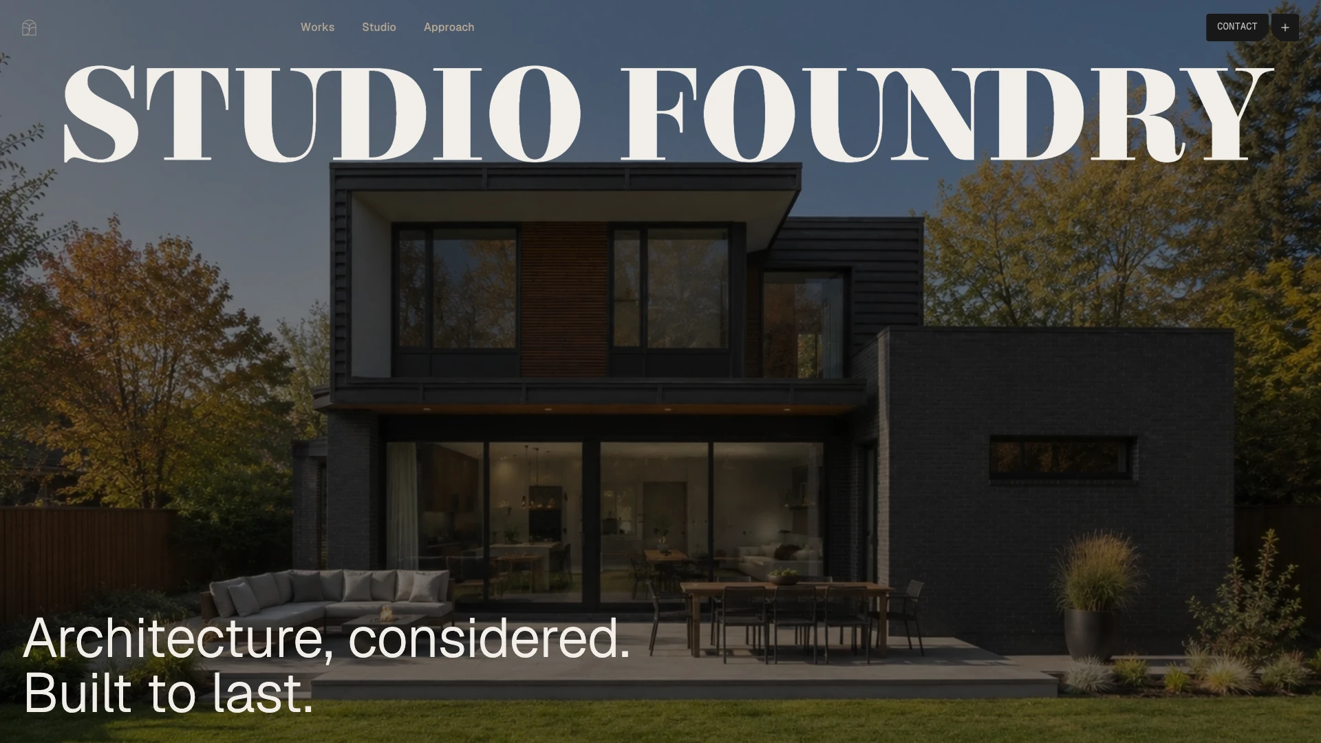
Studio Foundry
A prelaunch site that makes an architecture studio feel inevitable, not interchangeable.
Architecture
The problem
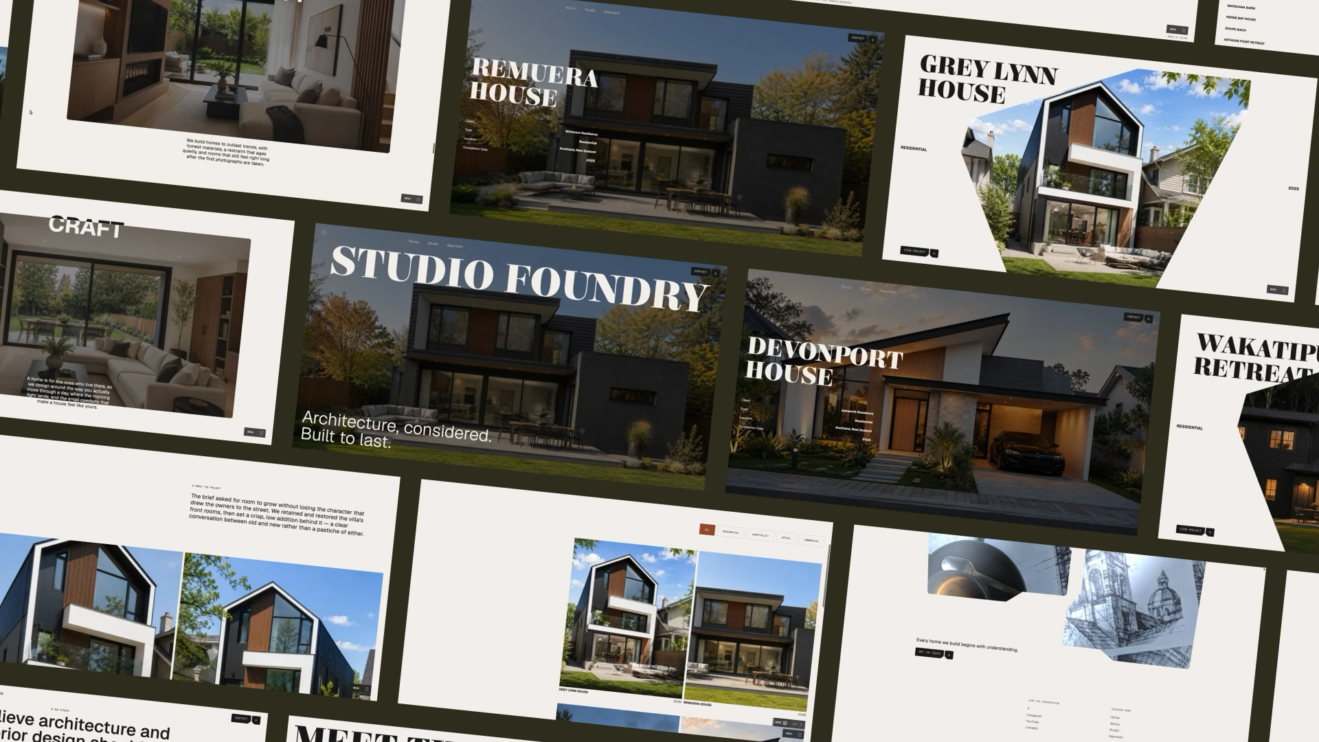
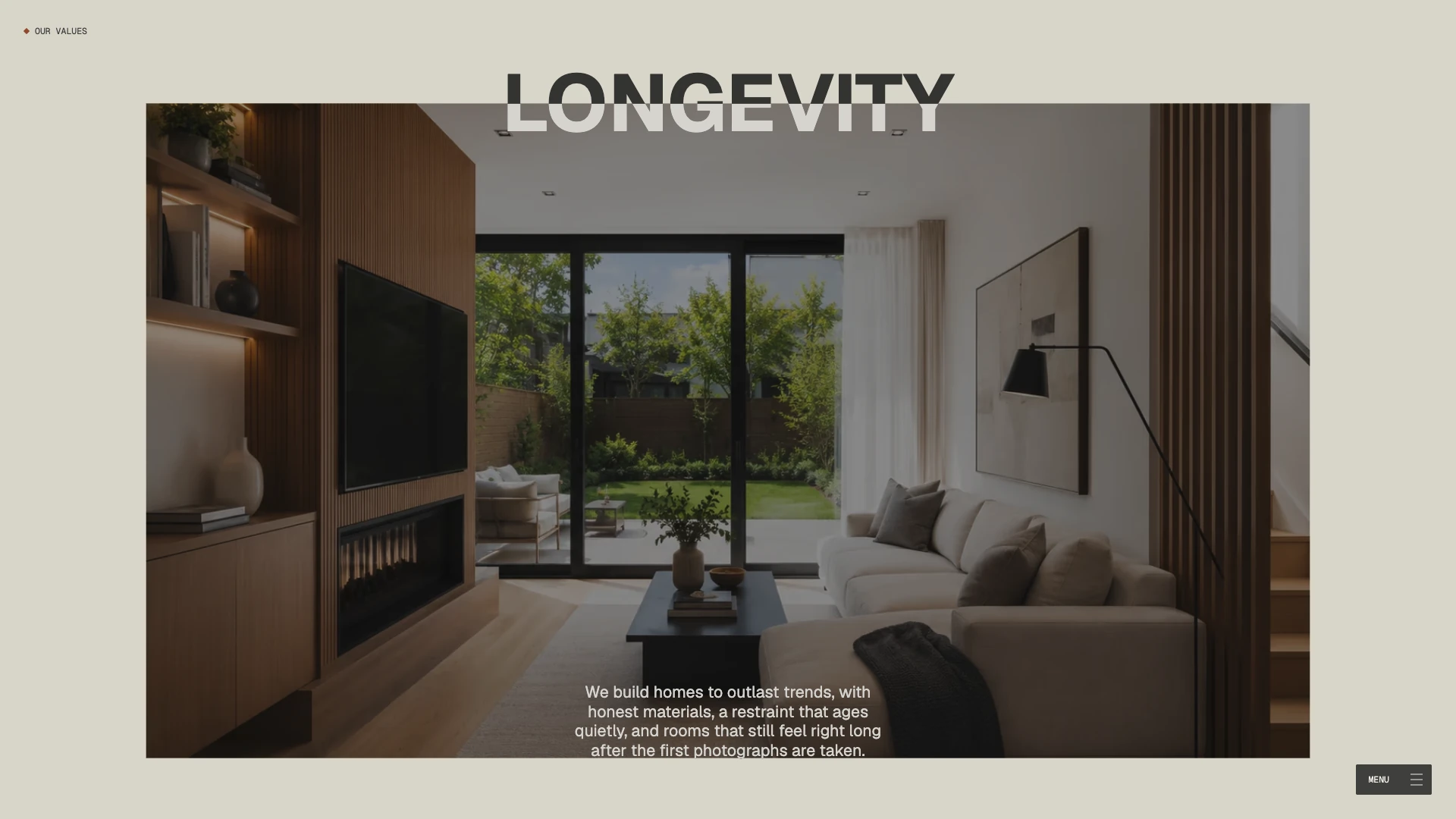
Creating intrigue for an architecture studio in a crowded field is a genuine challenge. Beautiful photography is where the category naturally leads, so we looked for a way to let the buildings themselves do more of the talking. Our answer was to let them do the interrupting. Using shape silhouettes as masks, the architecture frames itself. Threaded through a scrolling system, browsing becomes closer to a tour than a scroll, immersive but never loud.
Our role
UX/UI design, front-end development and WebGL implementation.
Design decisions
- Shape silhouettes used as masks, so the architecture frames itself instead of sitting inside a conventional photo grid.
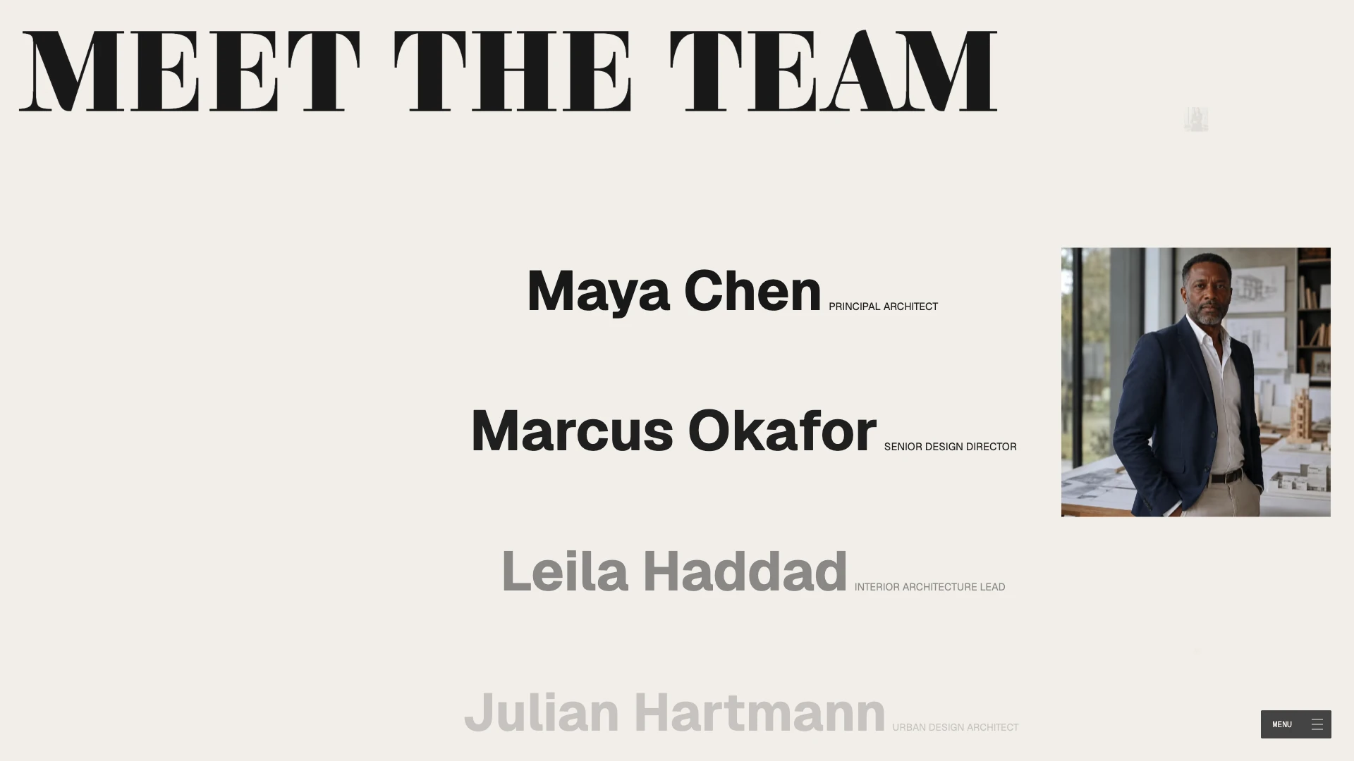
- A scrolling system that threads those frames together, turning browsing into something closer to a tour.
- Page changes, element morphs and WebGL reveals choreographed as a single gesture, so the eye is never jolted from one state to the next.
How we built it
- One WebGL card in the hero, morphing between shapes, while every card around it stays plain HTML. The GPU does one thing beautifully instead of many things adequately.
- Lazy loading and a considered preloader carry the rest of the page weight.
Mobile, accessibility and performance
- Reduced-motion and no-WebGL fallbacks take over quietly, so the brand reads the same whether the effects fire or not.
- A steady 60 FPS with WebGL running the length of the page, holding up on modest machines.
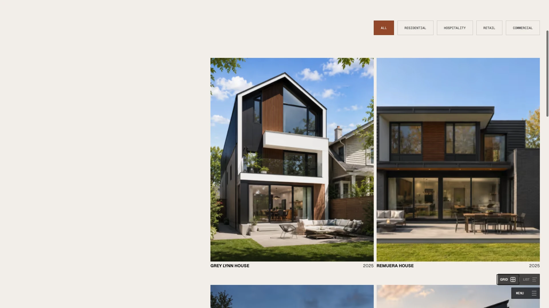
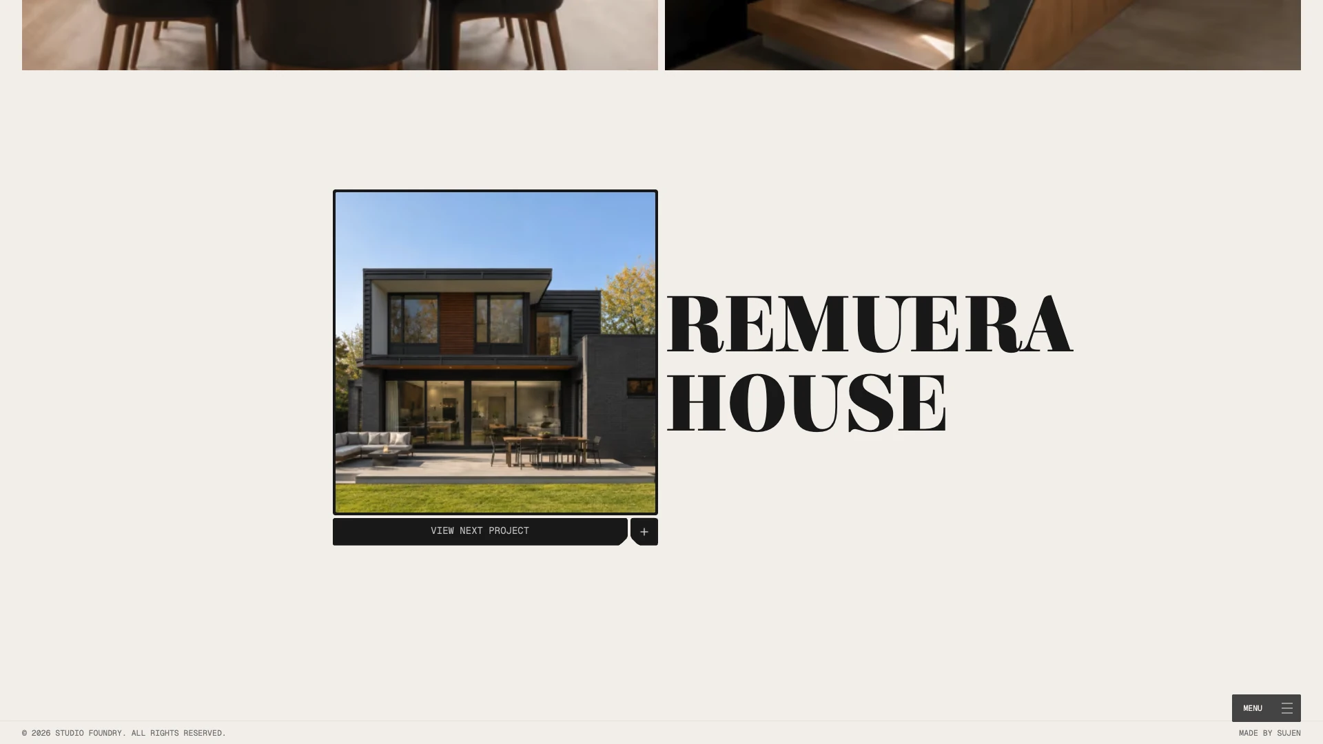
Selected screens
The result
The scene holds a steady 60 FPS with WebGL running the length of the page, on modest machines as well as fast ones — the payoff for spending the GPU on one card in the hero rather than on every card in the grid. With reduced motion set, or WebGL unavailable, the fallbacks take over quietly and the brand reads the same.